The Secret to Building a Strong Brand Aesthetic
Take It or Leave It creative advice
Welcome back to Take It or Leave It!
So many great questions this week. Today we’re diving into:
• How to shape the voice, tone, and feel of your brand
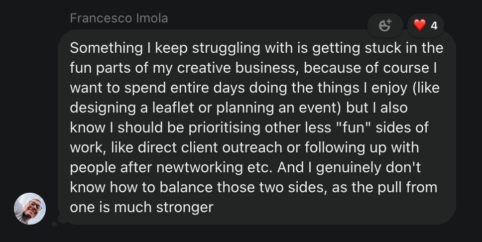
• Balancing the fun and not-so-fun parts of running a creative business
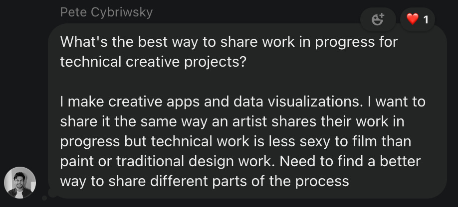
• Sharing your work in a way that doesn’t feel repetitive
• Getting in the habit of catching and releasing ideas
Not a paid subscriber? No worries! You can start a free trial and check it out. Already used your trial? It’s just $5 a month, and you can cancel anytime. No hard feelings. This is the best way to support what we do.
Now, without further ado, let’s get into it.
Thanks for this one, Kyle (and me).
Let’s talk about branding.
Whether you’re a creator, business, artist, or just trying to get paid for your creative skills, understanding brand is one of the most valuable tools you can have.
I’ve been obsessed with brands since I was a kid—Jordan sneakers, the skate companies in Tony Hawk’s Pro Skater, album rollouts during the MTV TRL days. There’s this overused saying on LinkedIn that annoys me, but it’s true:
A brand is not a logo.
It’s not the Nike swoosh, the Apple on your laptop, or the Yankees emblem. A brand, whether personal or for a company, is a set of values and beliefs that bleed into everything you create.
First, Define Your Mission
Before you get into colors, fonts, or aesthetics, you need to understand your values.
What are you trying to do? What’s the message you’re trying to get across?
Develop a mission statement.
At Create.Repeat, our mission is simple: To inspire and empower the next generation of artists and creators.
That’s the lens everything goes through. If a post isn’t inspiring or empowering to creatives, it’s not Create.Repeat. Everything else—fonts, textures, colors—is just taste. The mission is the purpose. And purpose is the most important part of building a brand.
Know the Rules!
When I was Creative Director at Cameo (yes, the “$200 for a birthday message from a C-list celeb” app), I led a brand overhaul. Part of that process was creating a brand guide—basically, a rulebook for what the brand is and isn’t. Logos, colors, voice, tone, and the dos and don’ts of how the brand should show up in the world.
So what was the biggest thing I learned?
Rules are good.
Creatives resist structure, but if you want your brand to be clear and focused, you need it. Trust me, I love throwing paint on a canvas and seeing what sticks. That’s great for art. But when it comes to branding, clarity beats chaos every time.
So start by figuring out what you actually like. And make sure you really like it because the best brands are consistent, and consistency can feel boring if you’re not intentional.
Build the Fence Around the Playground
Once you’ve got a sense of your taste, maybe you’ve made a moodboard, look for the common threads. Then define them and be strict.
• If a lot of your images lean toward warm colors, maybe your brand’s hero color is yellow.
• If your writing has a sarcastic edge, maybe that’s your tone.
• If you’re drawn to bold, clean typography, maybe that’s your visual identity.
Figure out what fits your message, and draw a line in the sand for what your brand is not.
How I Built Create.Repeat
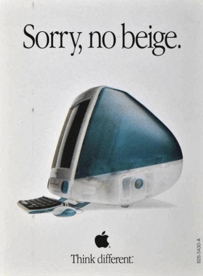
When I was developing Create.Repeat, I was coming off three back-to-back startup jobs where I kept clashing with marketing teams over ad design. Every time, I’d hear the same thing: The ad needs to be direct, feature the offer, no extra creativity, just convert.
So I started digging into old ads from the ’80s, ’90s, and 2000s—proof that ads could be creative, bold, and actually interesting. That moodboard turned into an idea, and after getting laid off for the third time in three years, I had nowhere to put all that creative energy.
So I used it to build Create.Repeat.
At first, it was just a personal project. I designed dozens of graphics, sometimes posting five times a day. The goal wasn’t to build an audience—it was to figure out my creative voice, develop a system, and make sense of my own branding before putting it out into the world.
The System Behind the Style
Every Create.Repeat post looks related. That’s intentional.
• Fonts: I use only two—Helvetica in all caps (a classic) and a case-sensitive sans-serif.
• Texture: I found a film grain pack with the perfect fade, so whether I overlay it on an iPhone photo or a vintage scan, it all feels cohesive.
• Logo Placement: The Create.Repeat logo is always centered at the top of every graphic. Some people hate watermarks, but I built it into the design for consistency.
• Effects: I use my own take on an ink bleed effect to make the text bolder, more eye-catching, and give it that retro, grunge aesthetic I love.
These choices weren’t random—they came from exploring and refining. I tried variations, I tested different styles, and over time, I locked in what felt right.
Finding Your Brand Voice
You need to write. A lot.
Your voice comes from doing the reps—seeing what clicks, what feels natural, what people resonate with. Experiment. Pay attention to what gets ignored and what sparks engagement.
And once you land on a style that feels true to you… Define it. Make a brand guide, a Notion doc, a Google Slides deck—whatever keeps you accountable.
This is how I’ve developed brand, but it’s not the only way. You can use 600 fonts, 40 colors, and still be cohesive—as long as there’s a throughline.
Even if everything you make looks different, it should still feel like part of the same family.
But the most important thing I want you to understand? Know your mission.
If you don’t know why you’re doing what you’re doing, everything else is just aesthetics.
I’d love to break down the Create.Repeat brand even further—maybe even share a full brand guide. Would people be into that?
Thanks for the question!
Hey Francesco! This is such a good question—and honestly, I’m right there with you. I’m still figuring out what works best for me, but here’s my two cents.
The blessing and the curse of being a creative is that the job is fun. If it were up to me, I’d spend every day experimenting, designing, and making things just to see what happens. But that’s not how it works, not if you want to make a career out of it.
When you take the next step in your creative career, you quickly realize that doing the work you don’t like is just as important as the stuff you love.
I’m a creative because I don’t like math, sales annoy me, and pitching myself every day just to get rejected? No thanks. But if you’re building something, these things come with the territory.
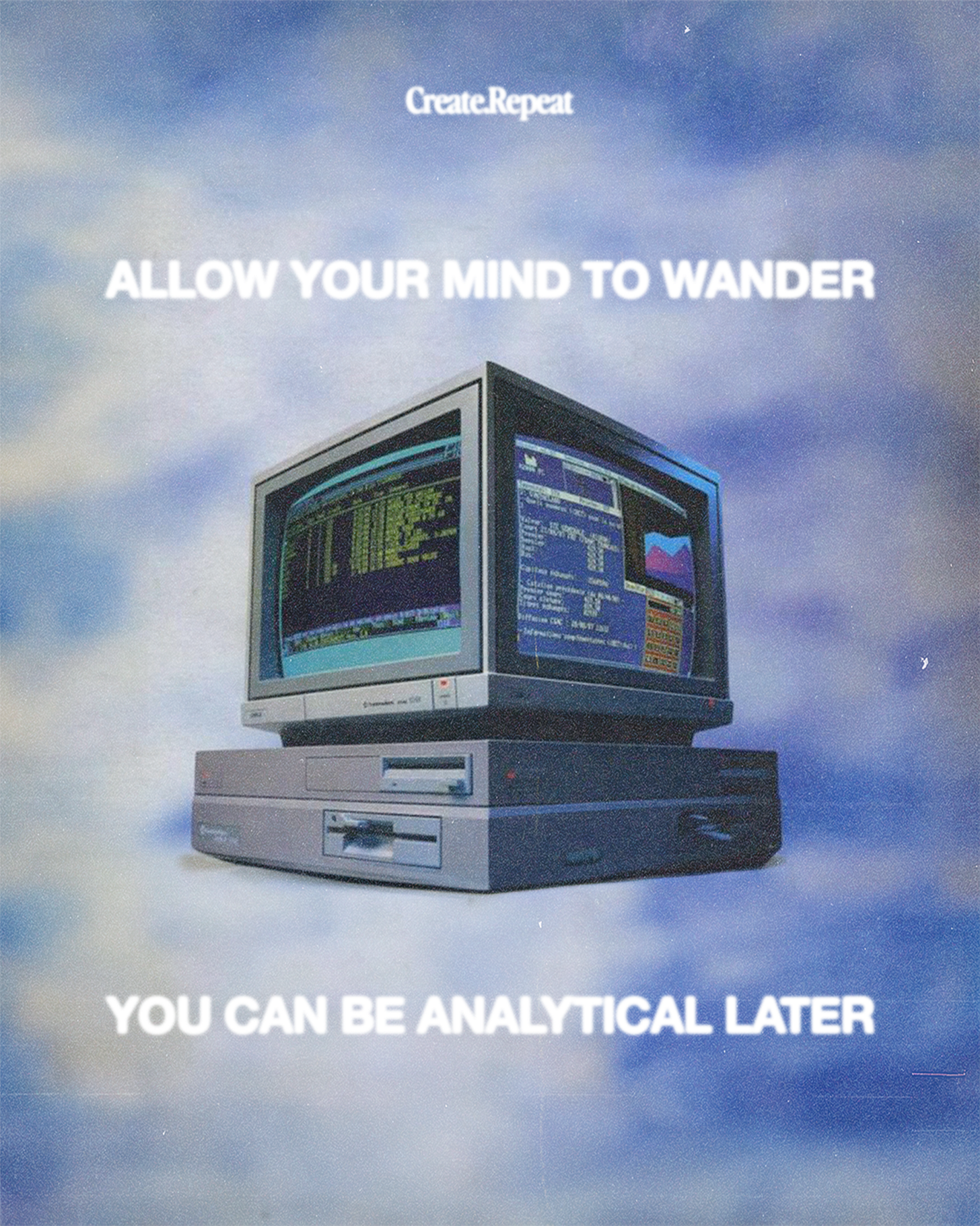
Lately, I’ve been structuring my schedule based on which side of my brain I’m using—creative or analytical—instead of trying to juggle everything at once.
• Creative Days: These are all about exploration. Some are productive, others feel like nothing happens. That’s okay. The slow, boring ones are just as valuable because that’s when you detach from the noise and reconnect with your own creative instincts.
• Work Days: Calls, follow-ups, outreach, reports—stuff that requires caffeine and a willingness to just get it done. On these days, I let myself listen to new music or catch up on podcasts while working through the less exciting tasks.
So far, I’ve noticed a huge shift. The creative days feel more exciting because I’ve built anticipation for them, and the work days weirdly can feel like a relief. It’s nice to turn my creative brain off for a second and just check things off a list.
The hardest part is resisting the urge to mix everything together. It happens to me all the time—I get into a good rhythm, then a new project pops up, throws my schedule off, and suddenly I’m back in everything-everywhere-all-at-once mode.
You can live in that chaos for a while, but eventually, it catches up to you. And then… burnout.
So, try to be proactive about scheduling both the fun and the not-so-fun days. They’re equally important—so treat them that way.
Really hope this helps you (and me)!
Hey Pete! This is a really interesting question. Happy to dive in.
Keep reading with a 7-day free trial
Subscribe to Create.Repeat to keep reading this post and get 7 days of free access to the full post archives.


